Oh Snap! Lee Min-jung battles bland concept
by HeadsNo2
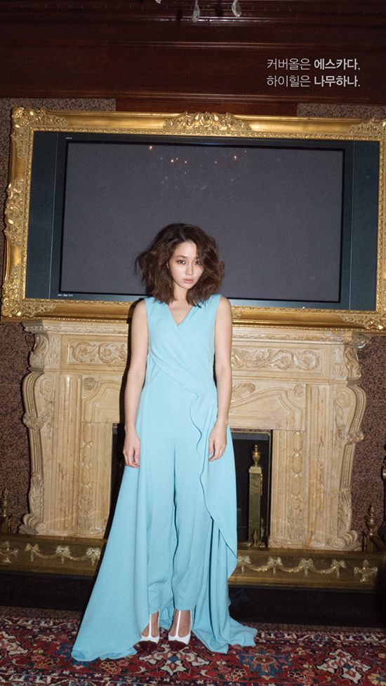
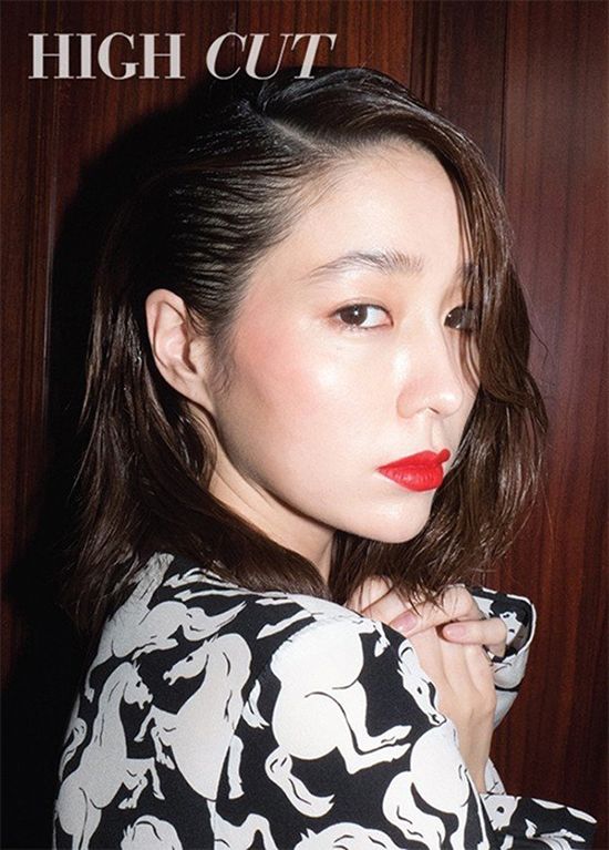
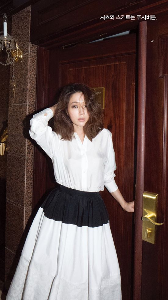
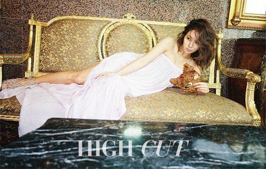
And, weirdly enough, a serious lack of straight lines in this month’s spread for High Cut. I guess I kind of get the we-caught-her-by-surprise idea, but why does it look as if the photographer is perpetually off-balance?
Channeling a glamorous ghost caught on camera while haunting the halls of an exotic hotel, the wife of superstar Lee Byung-heon and fairly new mother, Lee Min-jung, seems to be very much looking forward to her comeback project Come Back Ajusshi with other megastar, Rain. The show’s teasers promise cute and bubbly antics from both leads, so here’s hoping.
![]()
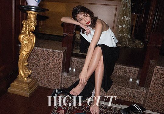
Via High Cut
RELATED POSTS
Tags: Lee Min-jung, Oh Snap!, photo shoots
 Interview with Kim Yoo-jung
 Hello Dramabeans series


![[2022 Year in Review] The Bean Count](https://www.dramabeans.com/wp-content/uploads/2022/11/beancount_2022.png)

Required fields are marked *
Your email address will not be published. Required fields are marked *
1 canxi
February 12, 2016 at 9:18 AM
The second picture is lovely, though. I like the red on her paired with the very understated make-up.
I wish the rest followed in a similar vein.
Required fields are marked *
Manin
February 12, 2016 at 11:00 AM
I agree the second is lovely and definitively the best of the bunch.
Required fields are marked *
2 pogo
February 12, 2016 at 10:19 AM
These photographs are some Terry Richardson nonsense.
(only in the style of lighting/taking photographs though, NOT the subject!)
Required fields are marked *
3 bbstl
February 12, 2016 at 10:52 AM
Haha they used the same hotel we've seen in a hundred dramas, I've come to LOL when I recognize the marble and ornate furnishings.
Required fields are marked *
Gidget
February 12, 2016 at 5:13 PM
No kidding. It's in serious need of an update.
Required fields are marked *
4 bamsa
February 12, 2016 at 11:11 AM
Trying hard to be edgy and cool and different but failed horribly. :(
Required fields are marked *
5 Mandy
February 12, 2016 at 11:14 AM
Okay whoever the photographer is, I hope he/she never comes close to any of my favs. These pictures are simply terrible; the backdrop, the lighting, the poses, the expressions, URGH.
LMJ is usually gorgeous so I'm blaming the photographer for the outcome. And her makeup artist. In one of the pics, she looks like she's been punched by the side of her eye.
Required fields are marked *
Lena
February 12, 2016 at 3:02 PM
They are more on the contemporary art side rather than fashion editorial, but I like the unorthodoxy.
Required fields are marked *
6 DD
February 12, 2016 at 11:26 AM
I just love the blue jumpsuit
Required fields are marked *
7 imzadi
February 12, 2016 at 11:57 AM
Seriously, I make better pictures with my cellphone.
Required fields are marked *
Kano
February 13, 2016 at 7:38 AM
Couldn't agree more
Required fields are marked *
8 snowysky
February 12, 2016 at 12:24 PM
She's a pretty lady but this photoshoot was terrible. Everything is so wrong and they managed to make her look very plain and not so pretty.
Required fields are marked *
9 Kiara
February 12, 2016 at 12:54 PM
Her breast must be hurting on the 4th picture.
Required fields are marked *
10 chaco
February 12, 2016 at 2:23 PM
i sort of vaguely get the vibe that they were trying to go for but it failed terribly. The components of this photo shoot so don't fit well together.
Required fields are marked *
11 crazythought
February 12, 2016 at 3:15 PM
She has a face to be proud of but not body figure.
and is she really a mother or just cover up or media play for image re-branding.
Required fields are marked *
12 Phuong
February 12, 2016 at 3:54 PM
there are rumors she threw a fit about oh yeon-seo being above her on the cast name list lmao then it got changed so oh yeon-seo was at the end, though oh yeon-seo is still in the middle. http://netizenbuzz.blogspot.com/2016/02/come-back-mister-cast-gets-into-fight.html?m=0
i think oh yeon-seo is more of the primary female lead than lee min-jung, however. she has more of a leading lady aura/charm. lee min-jung is very pretty too but she doesn't have that charm, plus her character is the perfect wife type whereas oh yeon-seo is playing one of the body-swapped characters.
Required fields are marked *
Phuong
February 12, 2016 at 4:41 PM
oops didn't read thoroughly enough. i meant that oh yeon-seo is the one with the aura and that she got moved to the end, while lee min-jung is still in the middle, as she was the first time around.
Required fields are marked *
13 Michi
February 12, 2016 at 3:55 PM
Beautiful face, bad styling, bad photography, and she doesn't have the body nor aura to pull off such concept
Required fields are marked *
14 roake
February 12, 2016 at 5:02 PM
yea....
not a fan of the lighting to say the least.
despite all that, she still looks beautiful.
Required fields are marked *
15 katasu1996
February 12, 2016 at 5:07 PM
This photoshoot is a mess... Just like her husband. Meh. I find it hard to see her the same.
Required fields are marked *
16 whitewire
February 14, 2016 at 12:13 AM
So pretty Lee Min-jung. LOVE U NOW MORE THAN EVER!
Required fields are marked *
17 whitewire
February 14, 2016 at 12:14 AM
But sorry why do the pix look like amateur photography? Even my point-and-shoot digicam can do better?
A beautiful glamorous model - and the photography / light is weirdo.
Required fields are marked *
18 korini
February 14, 2016 at 11:15 AM
And yet, remains blund... as per usual...
Required fields are marked *
19 TrinPie
February 17, 2016 at 8:38 AM
Only one I like is her laying on the couch. The rest look horrible. The lighting and concept is awful.
Required fields are marked *