Dramabeans gets an updated look
by javabeans

Looking around, you may notice a bit of a change — nothin’ fancy, just a few tweaks here and there, a splash of color to freshen up these parts. Every spring cleaning needs a fresh coat of paint to liven up the joint, right? So maybe we’re a little slow and got to spring a little late; that fourth dimension can get tricky that way.
It’s nothing quite as dramatic as the last time we introduced a new look — remember the wailing and gnashing of teeth then? Ah, good times. But we love the update and hope you’ll enjoy it as much as we do.
You should find all functionality to be the same, so no worries on that front. (If you run into problems, please let us know in the comments.) It’s mostly a cosmetic change; think of us as an Act 2 drama heroine getting her transformation montage — just without the chaebol hottie shaking his head no at every other outfit. ‘Cause we can foot our own makeover bill, thanks. Dramaland, take note!
Tags: bloggy
 Interview with Kim Yoo-jung
 Hello Dramabeans series


![[2022 Year in Review] The Bean Count](https://www.dramabeans.com/wp-content/uploads/2022/11/beancount_2022.png)

Required fields are marked *
Your email address will not be published. Required fields are marked *
1 srkambbs
August 21, 2012 at 10:00 AM
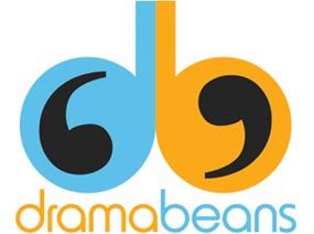
I love the logo :DDDDDDD but smh looks like boobs lol
Required fields are marked *
pinkipu
August 21, 2012 at 10:03 AM
ahahhaha i thought balls no offense :D
but overall design is cool!
Required fields are marked *
Mystisith
August 21, 2012 at 10:11 AM
OK. So I'm not the only one. :)
Required fields are marked *
Belphoebe
August 21, 2012 at 11:52 AM
You're not the only one :). It made me think of the current Olympic mascot. Wasn't supposed to be dirty, but there you have it!
Required fields are marked *
Brandi
August 21, 2012 at 12:53 PM
*in a small voice* I thought boobs too--when I first saw the favicon in my Favorites link. :)
Required fields are marked *
mariolawpanda
August 22, 2012 at 5:10 AM
As I saw the new logo that big, I thought penis. Haha. Sorry, but it does. Maybe because I had Lee Dong Wook in his shower scene as the banner as well. Balls and shaft.
I like the colors and the single quote but the db is a bit...
Required fields are marked *
Joy
August 21, 2012 at 11:37 AM
That was hilarious! It made really laughed out loud. :)
Required fields are marked *
jomo143
August 21, 2012 at 3:18 PM
Me, too.
Required fields are marked *
omo
August 21, 2012 at 6:44 PM
Mind already in gutter mode. Balls and sperms are all I see now.
Required fields are marked *
danny
August 21, 2012 at 7:19 PM
oh my, we thought the same, at first glance it looks like balls!
Required fields are marked *
pumpkinattack
August 21, 2012 at 7:53 PM
OMG. I seriously saw a JB until you said that. Now I can't un-see it. >_<
Required fields are marked *
pumpkinattack
August 21, 2012 at 7:57 PM
(I mean db, of course...)
Required fields are marked *
kimchi
August 21, 2012 at 8:04 PM
omg.. i thought that i'm really a pervert. the first thing that came to my mind.."balls". LOL
Required fields are marked *
akichan
August 22, 2012 at 4:03 AM
I agree!! so cool!
Required fields are marked *
Javabeans
August 21, 2012 at 10:05 AM
Dramabeans: We make everything dirty.
Required fields are marked *
jasmin
August 21, 2012 at 10:19 AM
Seriously I think of breasts!XDD Well that's not a bad thing, right!? Girls just wanna have fun!;-)
Required fields are marked *
Birthday Girl
August 21, 2012 at 10:22 AM
hahaahaha boobs with a spread out mustache or weird areolas.
Required fields are marked *
jasmin
August 21, 2012 at 10:27 AM
Of course!! xDDD
myweithisway
August 21, 2012 at 10:37 AM
One of many reasons why we adore DB!
Required fields are marked *
pabo ceo reom
August 21, 2012 at 10:48 AM
Hahaha. Before I even read the comments, I was thinking dirty already! Glad I'm not the only one ;)
Required fields are marked *
jenni
August 21, 2012 at 10:30 PM
oh goodness, i was already jumping in the gutter when i saw the logo. dramabeans got some balls 'yo. :D
Required fields are marked *
TomSea
August 21, 2012 at 3:02 PM
Look all you want, it’s 69 all the way!
Gonads gone wild!
Spot the difference between a 6 D cup by a 9 B cup!
Required fields are marked *
Haru
August 22, 2012 at 4:39 AM
woot!!! I saw 69 also xD
Required fields are marked *
Kiara
August 21, 2012 at 5:27 PM
All kinds of dirty.
Required fields are marked *
belleza
August 21, 2012 at 10:41 AM
This is a well-endowed blog.
Required fields are marked *
Mashimomo
August 21, 2012 at 12:05 PM
You've got some balls to say that.
Required fields are marked *
shiku
August 21, 2012 at 2:12 PM
LMAO!!!!!!!!!!!!!!!!!! Am jealous
Required fields are marked *
jomo143
August 21, 2012 at 3:19 PM
:D
Required fields are marked *
kaddictforever
August 21, 2012 at 5:12 PM
or well hung???
Lurve the new do Ladies :)
Required fields are marked *
meechellee
August 21, 2012 at 4:06 PM
haha, SAME. lol... *whimper* don't judge me.. hahah
Required fields are marked *
Ariel
August 21, 2012 at 11:23 PM
ha ha ha ha ha ha this is just so smexy!
Required fields are marked *
Belle
August 22, 2012 at 9:40 AM
LOL :)
Required fields are marked *
2 okdubu
August 21, 2012 at 10:00 AM
heh i like!
Required fields are marked *
3 singingzombies
August 21, 2012 at 10:02 AM
So... much... pink... text lol. Oh well, as a guy that reads recaps for dramas targeted at females, I guess I'll have to get used to it.
Required fields are marked *
zombiestakingacrap
August 21, 2012 at 10:36 AM
Pink is a manly color. Get used to it.
Required fields are marked *
Birthday Girl
August 21, 2012 at 11:01 AM
evidence zombie is 'right': http://www.cracked.com/article_19780_5-gender-stereotypes-that-used-to-be-exact-opposite.html
Required fields are marked *
Kiara
August 21, 2012 at 11:27 AM
HOT pink is very manly.
Required fields are marked *
slfowie
August 21, 2012 at 12:49 PM
"Pink is the color of a nice, raw, manly steak, or the blood of your enemies splattered on a white uniform." ( from the link above) don't think i will look at pink the same way again...
Required fields are marked *
okitokki
August 21, 2012 at 10:48 AM
only a few things are pink...
Required fields are marked *
AnotherFan
August 21, 2012 at 11:19 AM
Wait, where's the pink? I don't think I am color blind :-)
Required fields are marked *
Classy
August 21, 2012 at 12:02 PM
the titles they are pink so are the the archives box border. ALso if u select any post , it glows PINK!!!!
Required fields are marked *
Mama J
August 21, 2012 at 12:25 PM
We like a man who's confident enough to wear pink. No ruffles, though. We draw the line at ruffles.
Required fields are marked *
4 mtoh
August 21, 2012 at 10:03 AM
DB, looking good! Heheh I often use DB on Tweeter, so really, it's nice!
Required fields are marked *
5 Yushi
August 21, 2012 at 10:03 AM
omg I just refreshed and it completely changed. wahahahaha!! love the color scheme, so pretty~ and the logo is freaking awesome
Required fields are marked *
6 eternalfive
August 21, 2012 at 10:03 AM
LOVE the new logo! And the colour - although I'll need some time to get used to the reddish-pink (or whatever colour it is) and orange. I had this feeling today that you were going to do another makeover, and here it is! :O
Required fields are marked *
7 moofu baby
August 21, 2012 at 10:03 AM
Lovin' the new look! It's so bright & colorful, well done!! I'm always a sucker for a transformation montage ;)
Required fields are marked *
8 gracie
August 21, 2012 at 10:04 AM
It's definitely very trendy and colorful and happy-making, but I really loved the homey, woodsy?, warm feel of the old design. But I'm sure I'll end up loving this one too:) good job!
Required fields are marked *
9 Gabrielle O
August 21, 2012 at 10:05 AM
I like it :) and I looked at the old OLD page and the updates made this site look very professional and easy to access :P haha
Required fields are marked *
10 maechan
August 21, 2012 at 10:07 AM
wow it changed in minutes hehe looks nice but it'll take me a while to get used to it :D
Required fields are marked *
11 mujisan
August 21, 2012 at 10:07 AM
Love the new colors!
Required fields are marked *
12 Mystisith
August 21, 2012 at 10:10 AM
Ah! The design before 2010 sure didn't age very well (didn't have the chance to know dramaland yet). I sure prefer the actual one: Colors! :)
Required fields are marked *
13 crazedlu
August 21, 2012 at 10:10 AM
I like the tags: bloggy. Haha.
Required fields are marked *
14 kakashi
August 21, 2012 at 10:12 AM
super nice - looks fresh and light
Required fields are marked *
15 Annie
August 21, 2012 at 10:14 AM
Is there a way to get maybe a new comments system? There are so many times when I get lazy about commenting because of the system. It's not that important, of course, as your content's the most important thing, but just asking.
Required fields are marked *
16 Classy
August 21, 2012 at 10:14 AM
Its more prettier to look at !!
Required fields are marked *
Classy
August 21, 2012 at 10:17 AM
and linky?? bloggy??
ok, its making think stuffs that are kinda dirty and to rhyme it up..kinky...
Required fields are marked *
17 ELENA
August 21, 2012 at 10:14 AM
:)
Required fields are marked *
18 Diya
August 21, 2012 at 10:17 AM
love it but is it just me or is anyone else getting bombarded with ads?
Required fields are marked *
19 kumi
August 21, 2012 at 10:21 AM
can't really see light blue letters
Required fields are marked *
20 rearwindow
August 21, 2012 at 10:23 AM
Love the new look!
Required fields are marked *
21 becca_boo
August 21, 2012 at 10:27 AM
It's going to take some getting used to, but I think I like it. Nice color choices!
Required fields are marked *
22 dbsklove
August 21, 2012 at 10:29 AM
ooooooh~ i thought it was my computer that got messed up haha
i like the logo :D
Required fields are marked *
dbsklove
August 21, 2012 at 10:30 AM
and i just wanted to add.... that LMH REMAINS AS GOOD LOOKING AS EVAR WITH ORANGE AROUND HIM :)
Required fields are marked *
23 Dorotka
August 21, 2012 at 10:30 AM
I think I prefer the older look... this is somehow too sharp for me... somehow disturbs my reading... too contrasting? Or too much pink? :-)
But I may be just an old inflexible traditionalist... :-)
In any case, wish you all the best with your blogging. You have my admiration.
Required fields are marked *
DB5K
August 21, 2012 at 3:16 PM
I agree. I totally dislike the pink. Bleh.
And I don't think orange and light blue complement each other. And orange, pink and blue definitely don't complement each other.
And the logo seems like a tiny yin yang symbol. I didn't think of boobs or balls, but it's just too small for me. All the other icons for the sites on my tabs are minimalistic and easy to distinguish at an instant glance.
Sigh... Orange + gray looked nice together...
Required fields are marked *
24 Lauren
August 21, 2012 at 10:30 AM
Like the new look!
Required fields are marked *
25 ck1Oz
August 21, 2012 at 10:32 AM
What light blue letters?
I get the db for Dramabeans. And the black in the middle is it a stylised ying yang motive? Cos' I swear it looks like an embyro.
Why are some names mustard colours? Are they bloggers?
Oh and can you tell, I am the student that asks lots of questions in class.
But... as long as we have hotties on the headers all's well.
:-)
Required fields are marked *
DB5K
August 21, 2012 at 6:16 PM
Those are quotation marks, to symbolize, I suppose, DB's literary aspects, such as analysis and critique~~
But now that you've mentioned embryos, I can't get that image out of my head. I see 2 embryos :/
Required fields are marked *
26 Ivoire
August 21, 2012 at 10:33 AM
I noticed the changes a while ago, from the time they were made. I personally liked the other logo more, but this is your site and you do what you wish with it.
Required fields are marked *
27 POGA
August 21, 2012 at 10:35 AM
Oooh new look! To be honest, when you made that MAJOR overhaul last time I was surprised but LOVED the new style. Now the new colors are so pretty. ^^ I like hehe.
Required fields are marked *
28 Mawiie
August 21, 2012 at 10:37 AM
You know you've spent waaaaay too much time on DB when your mind went into panic 0.1 second after the page load because the color is not the same anymore xD Seriously I was like "Wuut wuut?! Something is different!"
But congrats on the makeover! It's indeed very spring-ish and fresh. It will remind us of better times when winter hits ;)
Required fields are marked *
29 Rai-Rai
August 21, 2012 at 10:38 AM
Oooh, I love it. Great colors and great logo...love.
Required fields are marked *
30 Arhazivory
August 21, 2012 at 10:40 AM
Ooooh. *stares at colours*
I likey~!!
Required fields are marked *
31 sebsob
August 21, 2012 at 10:46 AM
I had Journey's 'Don't stop believing' in the background when I clicked in to dramabeans, the perfect accompaniment to a changeover montage. "Living just to find emotion...some will win, some will lose, some are born to sing the blues...oh the movie never ends, it just goes on and on and on and on..."
I was really moved. So, I stare in awe and wonder. Beautiful, you seem familiar but somehow 'new.' Hehe.
Seriously, I love the new logo. The symmetry, the design and those quotes are just perfect.
Required fields are marked *
Lord of the Things
August 21, 2012 at 5:39 PM
Hahaha, I love it when iTunes starts creating a soundtrack to your life.
I love the colours too! So purdy...
Required fields are marked *
sebsob
August 22, 2012 at 4:56 AM
Hehe. True. Most of the time, I find that my playlist is inappropriate for the mood right now and I just end up on a hunt to find something 'just right.'
However when it in in synch with the moment, it is just awesome!
Required fields are marked *
32 canxi
August 21, 2012 at 10:52 AM
I noticed. I think it looks great :D Hahaha, glad I've been around long enough to see a change happen. That's always a nice thing. And yay at the blue and splashes of hot pink. <3
Required fields are marked *
33 jules
August 21, 2012 at 10:53 AM
Oooh, pretty! And hey, a change is as good as a holiday, right? (but wait: do you get holidays in the fourth dimension? hm.)
Required fields are marked *
34 dangerousgoods
August 21, 2012 at 11:01 AM
Loving the colour scheme; the pink and blue are oh so very pretty and are a sight for sore eyes. Looking forward to reading many recaps from here in the future!
Required fields are marked *
35 Abbie
August 21, 2012 at 11:08 AM
At first I thought there was something wrong with my computer, but then I saw this and I was like "Oh cool!" I love the new look. It's so pretty and awesome!
Required fields are marked *
36 cimi
August 21, 2012 at 11:16 AM
Hope you don't mind if I request something. In an exercise of self-restraint sometimes I like to read recaps after the completion of a drama (avoid the weekly angst once I'm hooked). Just as there are links to past episodes at the bottom of the recap would it be possible to add a link to the next episode of the series, ie if Gaksital recap 1 would have a link to episode 2? Only if it isn't too labour intensive and other readers would find it useful then perhaps you would take it into consideration. Thanks
Required fields are marked *
Javabeans
August 21, 2012 at 11:24 AM
Sorry, this one we'll have to leave off the table. We've got something like 1600 recaps on this site, and there's no way we can go back to every recap AFTER new episodes come along just to update the links. But thankfully, that's what this handy recap index is for!
Required fields are marked *
mary
August 21, 2012 at 11:57 AM
Do you build the list of related posts manually? I thought you used a plugin for that. :O
jb, I'm sure a shoutout for programming help will give you a couple of beanut geeks who can put together a wordpress plugin for you. :)
There's just the matter of trusting a crazy fangirl/ajumma with the code. But it's your call.
Required fields are marked *
Mama J
August 21, 2012 at 12:28 PM
Cimi what I do in that instance is go to the LAST recap but don't read it - I scroll to the bottom, select the first recap, and when I'm done I use my back button to get to the last recap again, select episode 2, and so on and so forth...it works ok for me that way, maybe for you too.
Required fields are marked *
37 mary
August 21, 2012 at 11:24 AM
I vote that us ladies wear the dramabeans logo like this:
http://www.fhm.com/imgs/630/500/0/original/300230_fullsizeimage_candice-swanepoel-orange-purple-blue-bikini.jpgx
Like a secret sign to spot fellow beanuts. :P
Required fields are marked *
Mama J
August 21, 2012 at 12:31 PM
oh you so do not want to see me in a bikini, honey.
Required fields are marked *
Tru2u
August 21, 2012 at 12:32 PM
LOL!!! Agreed!!
Required fields are marked *
38 Joy
August 21, 2012 at 11:39 AM
I am loving the new logo! So colorful and fresh, also it reminded me of quotations? Those little thingy inside the d and b. Overall, it's nicely done.
Required fields are marked *
39 vivyip
August 21, 2012 at 11:42 AM
I like the pink colored headline(?) (the words jump out more) color scheme is good! (though the white font on blue background take just a little getting used to
I also like the quote-looking logo.
Required fields are marked *
40 Emi
August 21, 2012 at 11:53 AM
Yup, I saw the logo and immediately thought 'balls.' Looks like it should be a logo for a BL/Yaoi website :)
Required fields are marked *
41 thedramaaddict
August 21, 2012 at 11:54 AM
i seriously love all the blue and pink everywhere!
i'll end up visiting every hour just to stare at the pretty colors and headers.
Required fields are marked *
42 Belphoebe
August 21, 2012 at 12:01 PM
I love the new colors! Everything looks very crisp and clean. I like how it feels updated and doesn't make me miss the old look (although I did like the old look as well).
And zomg, pink, yay!
Required fields are marked *
43 YChase007
August 21, 2012 at 12:02 PM
Since I view the mobile version... I see nothing lol Oh Well. Love your site even if it was purple & green.
Required fields are marked *
44 awkwardturtle
August 21, 2012 at 12:30 PM
I noticed the change of logo a while back, and I thought I was on a different site. Love the refreshing look.
Required fields are marked *
45 Mama J
August 21, 2012 at 12:34 PM
My colors are wrong...you look turquoise and orange now. But I love you so much that doesn't even matter. Will be interesting to see what you look like when I'm at home.
Required fields are marked *
46 Gom
August 21, 2012 at 12:39 PM
Hi guys!
I don't know if I'm the only one experiencing this. But when I post a comment, an error message pops up that there was something wrong with the site or something like that. And then when I go back to the site and look for my comment, it's there. I know it's a tiny hiccup, it's not bugging me at all. Just letting you know. :)
Required fields are marked *
~Feather~
August 21, 2012 at 1:42 PM
Yeah, that was happening to me too.
Although, when I commented on a different post, earlier today, I didn't have any problems.
Required fields are marked *
Mama J
August 21, 2012 at 2:30 PM
that had been happening to me for several days plus I had to add my info each time - it appears to be working now must have been part of the change
Required fields are marked *
jomo143
August 21, 2012 at 3:21 PM
Me, too. Especially when I am at work on their network.
Required fields are marked *
47 Sone
August 21, 2012 at 12:41 PM
I noticed. At first it was the icon in my favorites bar, now it's the color and format.
:) I like it!
Required fields are marked *
48 Brandi
August 21, 2012 at 12:50 PM
It looks pretty snazzy, but the only thing I have a problem with what's color is a link and what's not. So it's pink on the homepage, yellow in the comments section, and blue in the actual post? No, wait. So pink on the homepage are not links, blue in the comments section are not links--and the "Submit Comment" here button is pink. But the links in the Resources section at the bottom is white???? Please make the links a uniform color.
Required fields are marked *
49 Eun
August 21, 2012 at 12:52 PM
Two thumbs up! XD
Required fields are marked *
50 ranisa
August 21, 2012 at 12:55 PM
I see two back-to-back golf clubs and apostrophes. What a nice look... It's like summer turned to fall or spring to summer kind of look. Reminds me so much of Harvest Moon.
Required fields are marked *